Evolving the Offshore eBanking
Overview
The Offshore eBanking was a platform made up of independent journeys built over time. The overall experience struggled with consistency, navigation and scalability. The goal was to modernize the journeys of a platform already used daily for wealth tracking and international transactions.
My role
• Planning and running research • Defining the experience strategy • Information architecture • Defining product principles • Evolving the main journeys (Homepage, Transactions, Net Worth and Wire Transfer) • Building patterns shared across journeys • Aligning product, technology and business More than validating hypotheses, we wanted to understand how clients actually used the platform, where they struggled, and which patterns repeated across different journeys.
Problem
Before discussing any solution, we needed to answer a fundamental question.
Were the problems in the features, or in the way the whole platform had evolved?To answer that question, we brought together different sources of information. • Analytics • PMF • Satisfaction surveys • FullStory • Client interviews • Banker interviews • Workshops with Product and Engineering
Insight
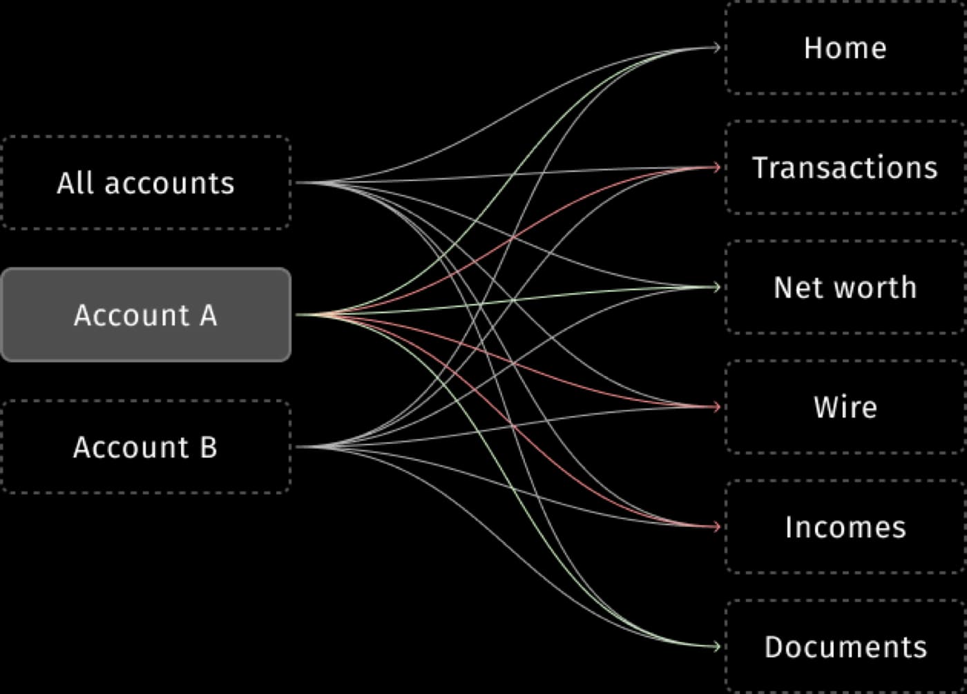
At first we believed we were solving problems in specific journeys. But along the way we realized the challenge was bigger. The main journeys (Transactions, Net Worth and Wire Transfer) were not independent problems.
They were manifestations of the same issue:
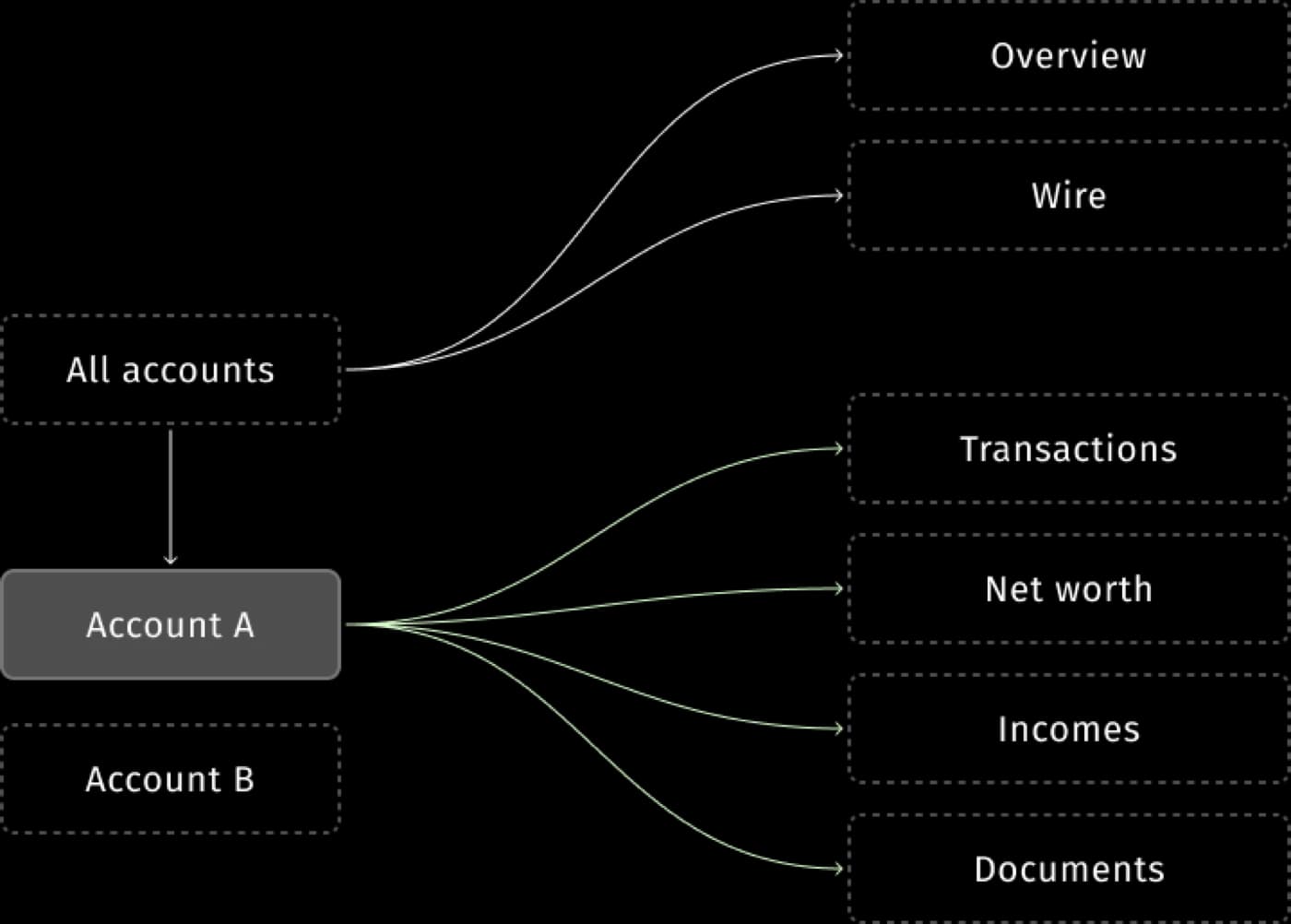
The real problem was the absence of a single strategy for navigating and organizing information.Clients struggled to understand their consolidated wealth, and the detailed data of each account.
How might we
How might we turn navigation into a simple experience in a scenario with so much complexity?
With the problem properly defined, we created four principles that came to guide our decisions.
- 1
Overview first, detail on demand
The experience should offer context before depth.
- 2
Consolidate before segmenting
Clients wanted to understand their wealth before analyzing specific assets.
- 3
Consistency across journeys
Similar patterns should produce predictable behaviors.
- 4
Incremental evolution
Relevant changes or new features had to land without breaking critical flows.
Applying the principles
Homepage
Consolidated view firstBefore drilling into any information, users should be able to quickly understand their wealth as a whole.
What we didOn the homepage, we prioritized a consolidated view of wealth before the breakdown of portfolios.

Transactions
ProblemClients didn't just want to look up transactions. They wanted to understand their balances, their movements and, above all, identify their different currencies.
What we didWe restructured how the journey prioritized information discovery, clustering balances by currency, supporting activities like financial investigation, verifying movements and browsing history.

Net worth
ProblemDisplaying wealth information wasn't enough. Clients needed to understand their wealth. To follow the profitability and performance of their assets in each portfolio separately.
What we didWith the homepage modernized, we could steer the journey's evolution toward a broader view of investments, turning the Net worth experience into a per-account experience with more detail, such as performance.

Wire transfer
ProblemThe operation was inherently complex; users faced many difficulties registering beneficiaries and making international transfers.
What we didWe mapped the journey's critical decisions and evolved the experience to reduce perceived complexity without compromising operational and regulatory requirements.

Beyond the interfaces
Design as part of the strategic triad
A good part of this work's impact happened outside Figma. My role was to translate client needs into product decisions the platform could sustain.
My work connected Product, Engineering, Analytics, Operations and executive stakeholders.
Impact
Results
- Client
• A more consistent experience • A better understanding of wealth • Less effort to complete critical tasks
- Product
• A strategy shared across journeys • Reusable patterns • More predictable evolution
- Organization
• Stronger alignment across areas • A foundation ready for future modernizations
Learnings
What I take from this project
The main lesson was understanding that modernizing a platform doesn't mean redesigning screens. It means creating a shared vision able to connect client needs, business goals and technology constraints into a single direction.
We turned multiple disconnected journeys into a unified experience strategy for the Private Banking platform our clients use.